10 Must-Have Elements of High-Converting Homepages
Are you a business owner looking to create a stunning and effective website using Framer? A well-designed homepage is crucial for attracting visitors and converting them into customers. In this post, we'll explore the 10 essential elements that every high-converting Framer homepage needs.
1. A Commanding Navbar
Think of your navbar as the roadmap to your site. It should be clear, concise, and easy to navigate. Here's what you need:
Essential Links: Include links to your homepage, products or services, about page, and contact information.
Sticky CTA: A prominent "Contact Us" or "Get a Demo" button that stays visible as users scroll down.
Search Bar: Make it easy for users to find specific information.

2. A Hero Section That Hooks
The hero section is your site's first impression. Make it count!
Clear Headline: A compelling headline that immediately communicates the value of your business.
Strong Subheading: A concise subheading that reinforces the main message.
Social Proof: Testimonials or reviews from satisfied clients can boost credibility.
Call to Action: A clear and compelling CTA that encourages users to take the next step.
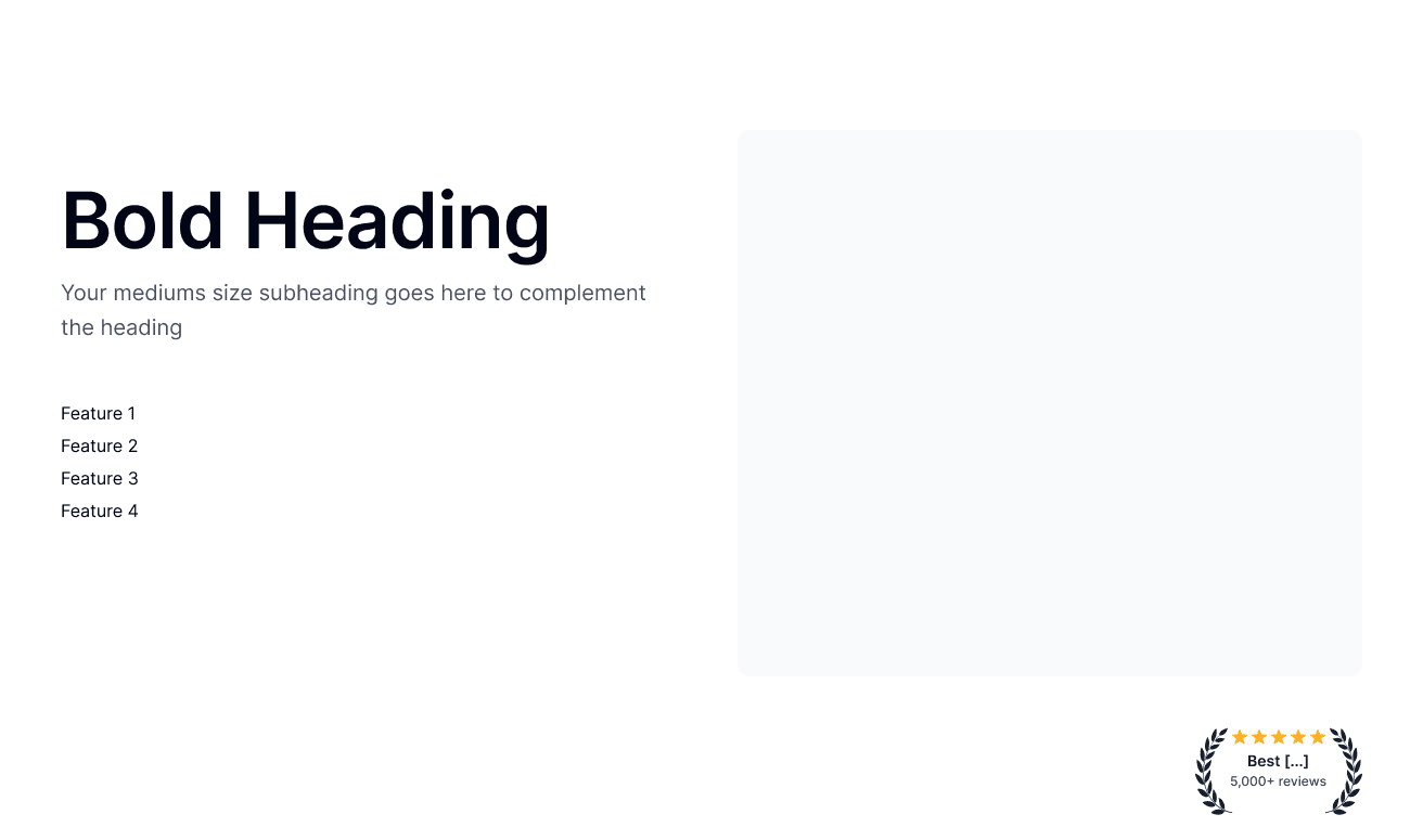
3. Feature: Showcase Your Unique Selling Proposition (USP)
What sets your business apart from competitors? Highlight your USP in a clear and concise way. Use visuals, icons, and bullet points to make it easy for users to understand the benefits.

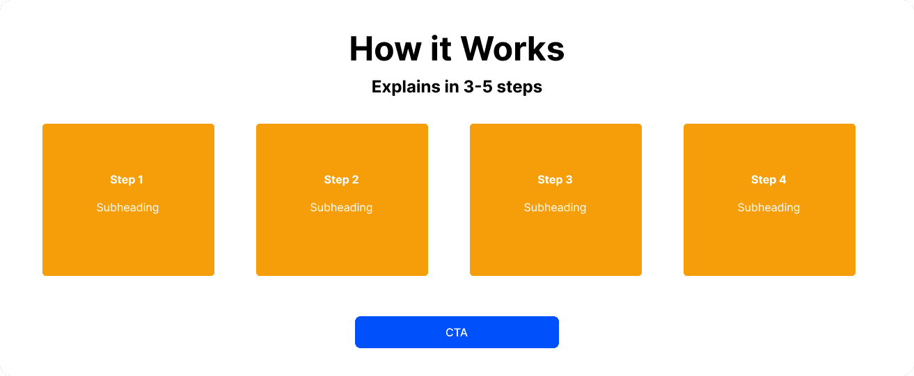
4. A Simple How-It-Works Section
Don't overwhelm users with technical jargon. Break down your processes or products into simple, easy-to-follow steps.
5. Benefits That Speak Volumes
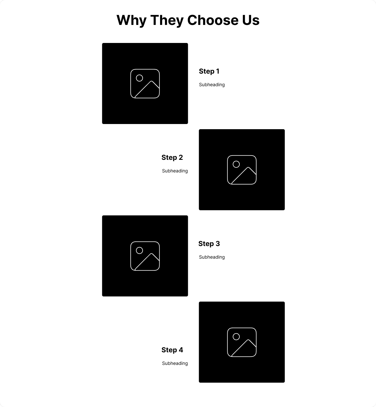
People don't buy features; they buy benefits. Clearly articulate how your products or services will solve their problems or improve their lives.
6. Testimonials That Convert
Social proof is a powerful tool. Share testimonials from real clients who have had positive experiences with your business. Include their names, photos, and specific use cases.

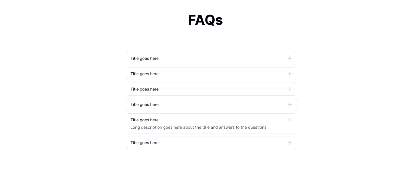
7. Address FAQs
Anticipate common questions and provide clear, concise answers. This shows that you've considered your customers' needs and concerns.
8. A High-Converting CTA
Your CTA should be visually prominent, action-oriented, and placed strategically on the page. Use strong, persuasive language to encourage users to take the next step.

9. A Trustworthy Footer
The footer is often overlooked, but it's an important opportunity to build trust and provide essential information.
Logo and Copyright: Clearly display your brand identity.
Privacy Policy: Link to your privacy policy to reassure users about data security.
Contact Information: Provide multiple ways for users to contact you.
Social Media Links: Connect with your audience on social media.

Conclusion
A well-designed Framer homepage can be a powerful tool for attracting new customers and driving business growth. By incorporating these 10 essential elements, you can create a website that effectively communicates your value proposition, builds trust, and encourages visitors to take action.
Created on
Sunday, October 20, 2024

